The “signature” of Poggendorff type illusions

The Poggendorff illusion is by no means alone amongst the so-called geometric illusions in dividing opinion for so long. In fact, these illusions must be said to have proved a disappointment. As more and more were discovered, mostly in the later nineteenth and early twentieth centuries, they seemed to offer a laboratory for inference of the processes and strategies on which vision depends. But it proved very hard to get good data. You can measure the average variations in strength of illusion for samples of observers, for example as figures are rotated. But the data never offers the big spikes, which help decisively to establish one theory over another in physics or chemistry. The graphs of what are called psychophysical data, though often consistent across studies, are always more or less floppy curves. The trouble is, you can fudge just about any theory to fit a floppy curve. No wonder that the geometric illusions, though still tantalising, attract fewer young researchers nowadays. You can't blame them if they tiptoe away from seemingly unresolvable disputes between dinosaurs of the discipline.
However, the Poggendorff family of illusions comes close to being the one exception as far as data goes. True, not even Poggendorff studies present real spikes in the data. But they do show much more characterful patterns of variation - enough to comprise a signature. My aim here is to characterise the signature, and then to suggest a model of one way that it might have arisen.
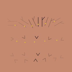
Firstly, in all the variants of the illusion studied, shown above to the right, misalignment increases with the size of the angles involved, except in the variants like the classic Poggendorff figure, which contain both acute and obtuse angles. In these misalignment increases with size of the obtuse angle. The degree of misalignment observed also depends for all varieties of figure on their orientation, varying systematically as the test lines sweep through 360 degrees, like a hand on an analogue clock, as suggested in the figure to the right.
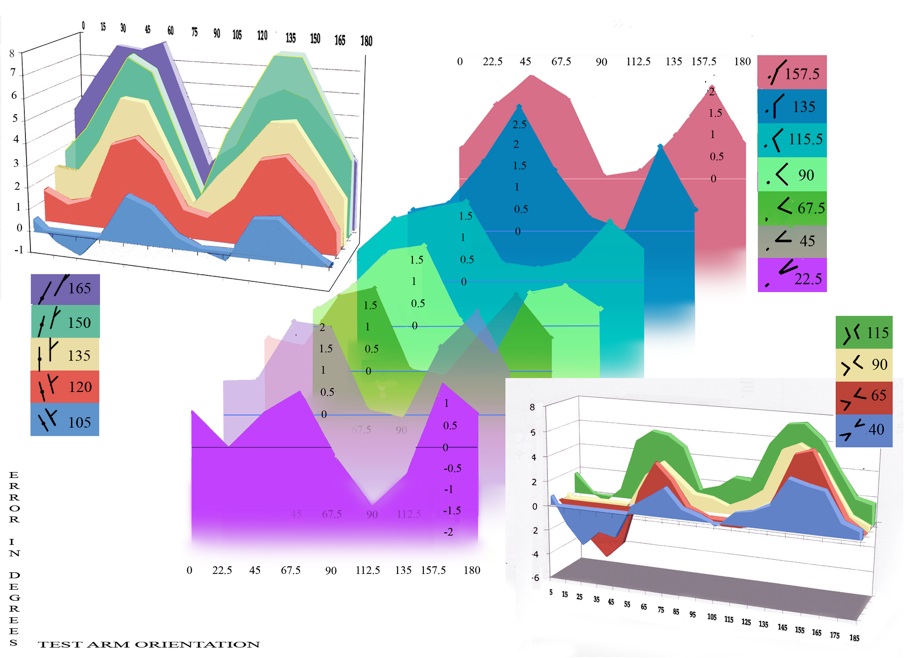
There is experimental data for the variation in effect with rotation of three figures in particular, summarised in the figure below. The figures studied appear in the rectangular panels beside each stack of graphs, showing the colour coding for curves representing angles of increasing size between test and inducing arms. The horizontal axes then show varying test arm orientation, and vertical axes show apparent misalignment.

Misalignment (vertical axis) varying with rotation (horizontal axis) in three varieties of figure as angle size increases from front to back of each stack. Left, re-plotted from Weintraub et al. (1980, figure 1); centre re-plotted from Weintraub and Brown (1986, table 1); right from a 2003 study by the author.
Remember that I have translated scores from studies in the literature into conventions I adopted (see the previous section, Scoring conventions). Weintraub et al. (1980), to the left above, studied misalignment in Poggendorff figures with one arm replaced by a target dot, for a range of angles as shown. Weintraub and Brown (1986), centre above, looked at misalignment between one arm of an isolated angle and a target dot for a range of angles. I also, as an amateur researcher in 2003, measured my own observations from rotation of four pairs of opposed angles, and my results in summary appear to the right above. We will also be referring to some results from Ninio and O’Regan (1999), who studied only one size of angle, with test arm joining inducing arm at 45 degrees, but in a range of variant figures. In contrast, Greene (1994), gives partial rotation results only for a figure similar to (f) in the sequence shown upper right, but for a range of angles between test and inducing arms.
Forget for now the detail of the graphs. Remember that the graphs show variation in perceived misalignment both with increase in angle size between test and inducing arms, and with figure rotation. The most striking feature is the steady increase in strength of the illusion with larger angle sizes, always choosing the obtuse angle in figures containing an acute as well as an obtuse angle. The increase runs from front to back of each stack of graphs here, and is familiar in earlier research on Poggendorff related figures. It is also supported by Greene (1994). Scores for the smallest angles, at the front of the graphs, even drop into negative territory.
But then there is a more subtle trend in the stacks. At smaller angles in the two sets of data from Weintraub and co-workers, shown at the front of the graphs left and centre, we see a fall - in places into negative scores - and a rise into positive territory within each quadrant (rotation through 90 degrees). To the rear of each stack, showing results for the largest angles, there is only rise to a positive maximum and then a fall back to zero within each quadrant. In my own data, to the lower right, we can see the same trend from front to back of the graph, though not to the extent of eliminating the initial dip in scores within each quadrant. But that turns out to be quite consistent with the other results, since there were no very large angles in my study. The largest was 115 degrees, and indeed there is good agreement in overall shape between the rear curve in my data, lower right, and the curve for a 120 degree angle, in red in the data to the far left. The pattern of changing variation within quadrants as angle size rises was recognised in the data in all the studies just cited.
That pattern with increasing angle size, from curves showing a dip and a rise in each quadrant, to ones presenting just a rise to a maximum at a test arm orientation of 45 degrees, seems on the basis of the data available to date to be a signature of the Poggendorff type illusions.
One goal for any explanation of the illusions would then be to account for the signature. I shall show that one way of accounting for it would be by summing a small number of component curves in each study, each varying systematically, and generated according to a simple rule from axes projected into the visual field, or from salient orientation cues in the figures.

Versions of the Poggendorff illusion. The classic figure is (h), but the versions for which we have good data for variation in illusion with rotation and size of angle between inducing and test arm are (g), (c) and (d)
Misalignment was measured as figures rotated in two dimensions in the plane of the screen.
