The role of cardinal axes in the illusions

The first culprits to implicate in Poggendorff illusions are cardinal axes in the visual field. To explore their role, let us set aside for the moment any suggested physiological mechanism for the misalignments we see in these figures. As we observe misalignment varying with rotation in these figures, so compelling is the effect that it can seem as if we were observing little objective physical systems. Let us first consider them as if they were just that, seeking only for now to characterise and measure the effects we observe.
First consider the cardinal axes running through the figures. In the figure to the right, most observers report a slight but definite misalignment, as if the segments had shifted in the direction of the arrows. In this form the illusion is called either the Zehender illusion or the Poggendorff without parallels.
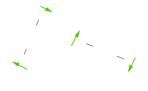
The Poggendorff without parallels, with arrows indicating the direction of the slight shift usually reported. Misalignment is attributed to the effect of cardinal axes in the visual field.
It is as if each segment had been just a touch pushed out of alignment, away from the nearest axis. That is, the segments appear nudged out of position, but with no change in orientation, so that each appears just fractionally further from the nearest cardinal axis than it objectively is. The effect seems greatest when the segments are at about 22 degrees, maybe even less, from vertical and horizontal. The cardinal axes therefore could somehow be implicated in the observed misalignment.
As mentioned, the strength of the effect varies with the orientation of the line segments, so we now want to make a graph of how illusion might vary with rotation, supposing that the cardinal axes were implicated. We begin by isolating, to the right, the contribution that would be made just by the vertical cardinal axis.
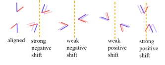
Diagram of variation of the extent and direction of test line shift, attributed to the vertical axis in the observer’s visual field, observed with rotation of a pair of opposed acute angles.
As diagrammed to the right, with the test lines vertical they appear pretty much aligned, but once the test arm has rotated a small way clockwise from the vertical axis, the arm appears pushed away from the axis in a clockwise direction. The vertical axis will continue to affect misalignment in that direction, but with decreasing force, until the test arms have rotated to 90 degrees. Thereafter the effect reverses, only weakly at first, but producing a growing anti-clockwise shift as the test lines rotate towards vertical again.
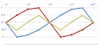
The misalignment observed attributed to the vertical axis in the figure above, graphically shown as the blue curve, with the reciprocal effect from a horizontal axis added in red. Summing the curves gives the yellow curve.
Let us now make a graph of that effect, bearing in mind that we are scoring a clockwise shift in negative degrees of error and an anti-clockwise shift as positive. The effect of the vertical axis is shown by the blue line in the graph to the right. From zero misalignment at vertical, the effect of the axis as the arms begin to rotate clockwise is at first to induce a strong clockwise shift. Scores accordingly fall rapidly to a strong negative maximum, whilst test arms are still near the vertical axis, returning more gradually to zero as they approach 90 degrees. Thereafter, from just after 90 degrees through to 180 degrees, the effect of the vertical axis reverses, to affect misalignment in the direction we are scoring as positive, but this time rising slowly, reaching a maximum as arm orientation approaches vertical and then dropping sharply to zero as the test arms align with vertical.
Now we need to add a similar sequence for the counter effect of the horizontal axis, represented in red. This acts in opposition to the effect of the vertical axis, but always with effect changing slowly as effect from the vertical axis rises rapidly, and vice versa. When we now sum the two axes, we obtain a rather characterful yellow curve. It dips gently into negative, rises slowly into positive territory, dips sharply into deeper negative through the centre of the graph, and rises gently back into positive scores.
That curve fits some professional experimental data quite well. There is a variation of the Zehender figure, which consists in misalignment not between two line segments, but between just one line segment and a target dot. As measured by Ninio and O’Regan (1999) both the version with parallels and the line and dot variant give very similar results (their figure 5b). Response to the line and dot version with rotation was also measured by Weintraub and Brown (1986). The results from both studies (coloured blue and red respectively) are replotted to the right, together with the model (in yellow).
But (and it’s a big “but”): the good agreement seen between observations and model depends on one refinement: in the model, the two axes, vertical and horizontal, no longer make equal contributions. To match the data in the comparison figure to the right, I have had to multiply the error contributed to the yellow line by the vertical axis in the model figure above, (where the maximum error was arbitrarily set at 1) by 1.15, and to multiply the error attributed to the horizontal axis in that model figure (also set at a maximum of 1) by 1.65.
It is as if either the variant of the illusion, or the experimental set-up, had aroused the cardinal axis system, but with the contribution from each axis set at a different level. We will see below that in matching the data from experiments with models, I found that for each of the three sets of data studied I had to set the relative contributions from horizontal and vertical axes at a different ratio, as setting a different maximum to the contribution made by either. However the ratio for each of the three sets of data could then be kept constant as I increased the contributions from each axis with increasing angle size. For Weintraub et al (1980), in which the maxima in each quadrant appear approximately equal at 1.38 degrees, I set the contributions from each axis as equal; for Weintraub and Brown (1986), where maxima tend to be greater in the first quadrant at 1.5 degrees, I set the horizontal axial contribution as greater; and for my own observations, with maxima strikingly higher in the second quadrant at 4 degrees, the vertical axis had to be greater. I suspect the latter might be a quirk of my own vision, since the data in that study came only from my own observations.
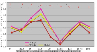
Results for a line and dot figure with rotation re-plotted from Ninio and O’Regan (1999, figure 5b) in blue, Weintraub and Brown (1986, table 1) in red and our model (yellow). The vertical axis contribution as shown in the graph above has been multiplied in the model by 1.15, and the horizontal axis contribution by 1.65.

The cardinal axis contribution to the models in following sections, for comparison with data re-plotted from Weintraub and Brown (1986), to the left, Weintraub et al. (1980), centre, and the author’s 2003 study, right.
Detailed numerical results as mentioned above are given separately, but in the figure above we can see a graphic display of the cardinal axis contributions, which we will apply below in matching models and data. Note that in all three cardinal axis models we see how effect rises gently with angle size, but with the characteristic shape of each set of curves dependent on the ratios between vertical and horizontal axis contributions for that set.
Variation in these cardinal axis models is symmetrical about the zero line. That was also the case for the observed results for the Poggendorff without parallels, shown in the diagram with a grey background, higher up to the right on this page. But recall the graphs of results from more complex versions of Poggendorff related illusions, which we saw as the main image in the section on the Poggendorff “signature”. With these results, for example those to the right, (replotted from Weintraub et al. 1980), though the curves for the smallest small angles still resemble those for the Poggendorff without parallels, they are somehow lifted decidedly into positive territory. Cardinal axes effects alone clearly cannot account for the extent and variation of illusion seen, so we need to seek other agencies.
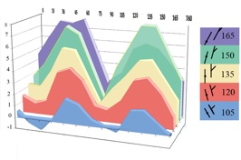
Unlike the results for the Poggendorff without parallels (see the figure with graphs on a grey ground, above), which are symmetrical about the zero line, results from more complex Poggendorff type figures, like these from the study by Weintraub et al., 1980, are overwhelmingly in positive territory. The cardinal axis contribution alone can’t explain that.